Building a Form
Wait, don't close your browser! You had to know this was coming eventually, didn't you? And you've probably realized by now we wouldn't even have this section in the tutorial unless Redwood had figured out a way to make forms less soul-sucking than usual. In fact Redwood might even make you love building forms.
Well, love is a strong word. Like building forms?
Tolerate building them?
We already have a form or two in our app; remember our posts scaffold? And those work pretty well! How hard can it be? (Hopefully you haven't sneaked a peek at that code—what's coming next will be much more impressive if you haven't.)
Let's build the simplest form that still makes sense for our blog, a "Contact Us" form.
The Page#
We can put a link to Contact in our layout's header:
And then use the BlogLayout for the ContactPage by making sure its wrapped by the same <Set> as the other pages in the routes file:
Double check that everything looks good and then let's get to the good stuff.
Introducing Form Helpers#
Forms in React are infamously annoying to work with. There are Controlled Components and Uncontrolled Components and third party libraries and many more workarounds to try and make forms in React as simple as they were originally intended to be in the HTML spec: an <input> field with a name attribute that gets submitted somewhere when you click a button.
We think Redwood is a step or two in the right direction by not only freeing you from writing controlled component plumbing, but also dealing with validation and errors automatically. Let's see how it works.
We won't be pulling any data from the database on our Contact page so we won't create a cell. Let's create the form right in the page. Redwood forms start with the...wait for it...<Form> tag:
Well that was anticlimactic. You can't even see it in the browser. Let's add a form field so we can at least see something. Redwood ships with several inputs and a plain text input box is the <TextField>. We'll also give the field a name attribute so that once there are multiple inputs on this page we'll know which contains which data:

Something is showing! Still, pretty boring. How about adding a submit button?

We have what might actually be considered a real, bonafide form here. Try typing something in and clicking "Save". Nothing blew up on the page but we have no indication that the form submitted or what happened to the data. Next we'll get the data from our fields.
onSubmit#
Similar to a plain HTML form we'll give <Form> an onSubmit handler. That handler will be called with a single argument—an object containing all of the submitted form fields:
Now try filling in some data and submitting, then checking out the console in Web Inspector:
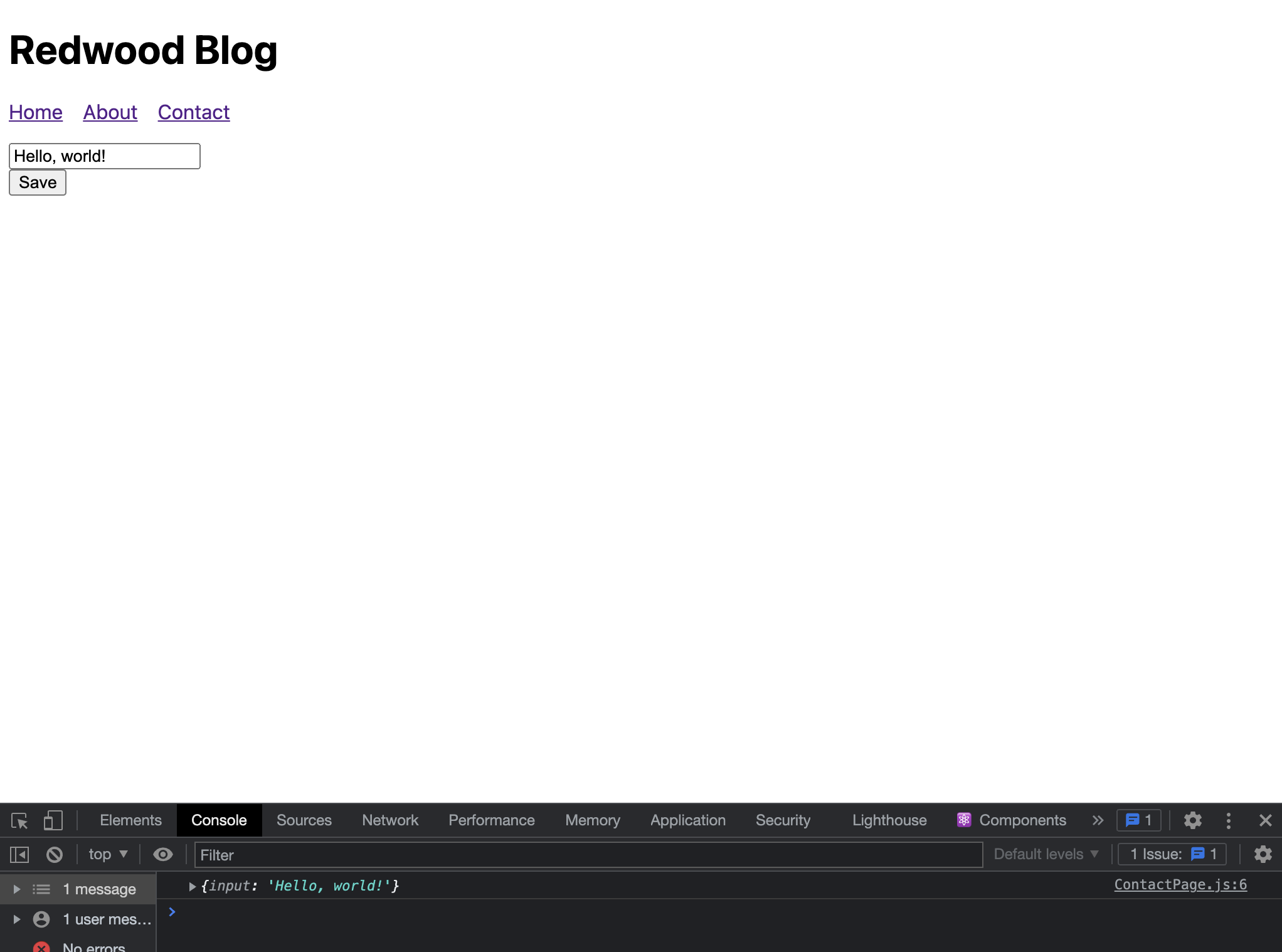
Great! Let's turn this into a more useful form by adding a couple fields. We'll rename the existing one to "name" and add "email" and "message":
See the new <TextAreaField> component here which generates an HTML <textarea> but that contains Redwood's form goodness:

Let's add some labels:
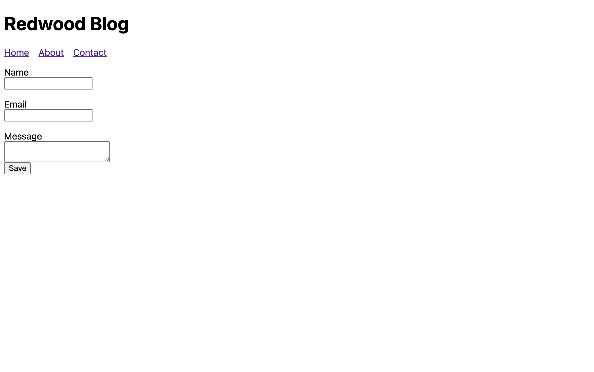
Try filling out the form and submitting and you should get a console message with all three fields now.
Validation#
"Okay, Redwood tutorial author," you're saying, "what's the big deal? You built up Redwood's form helpers as The Next Big Thing but there are plenty of libraries that will let me skip creating controlled inputs manually. So what?" And you're right! Anyone can fill out a form correctly (although there are plenty of QA folks who would challenge that statement), but what happens when someone leaves something out, or makes a mistake, or tries to haxorz our form? Now who's going to be there to help? Redwood, that's who!
All three of these fields should be required in order for someone to send a message to us. Let's enforce that with the standard HTML required attribute:

Now when trying to submit there'll be message from the browser noting that a field must be filled in. This is better than nothing, but these messages can't be styled. Can we do better?
Yes! Let's update that required call to instead be an object we pass to a custom attribute on Redwood form helpers called validation:
And now when we submit the form with blank fields...the Name field gets focus. Boring. But this is just a stepping stone to our amazing reveal! We have one more form helper component to add—the one that displays errors on a field. Oh, it just so happens that it's plain HTML so we can style it however we want!
<FieldError>#
Introducing <FieldError> (don't forget to include it in the import statement at the top):
Note that the name attribute matches the name of the input field above it. That's so it knows which field to display errors for. Try submitting that form now.
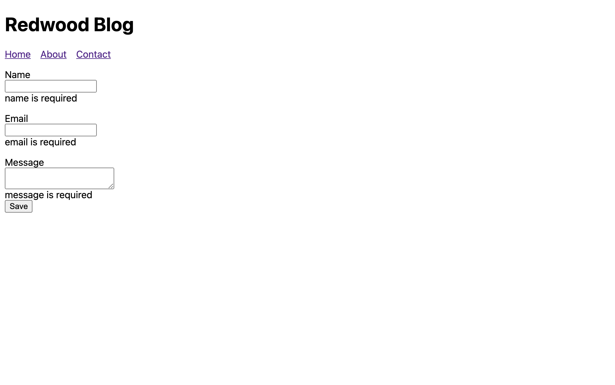
But this is just the beginning. Let's make sure folks realize this is an error message. Remember the basic styles we added to index.css back at the start? There's an .error class in there that we can use. Set the className attribute on <FieldError>:

You know what would be nice? If the input itself somehow displayed the fact that there was an error. Check out the errorClassName attributes on the inputs:
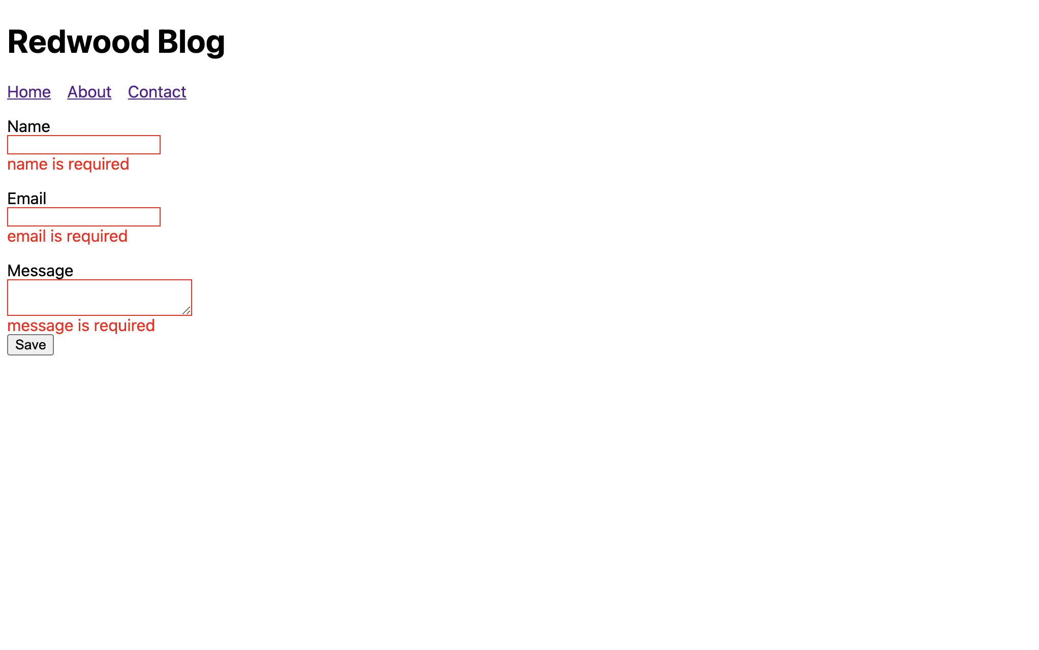
Oooo, what if the label could change as well? It can, but we'll need Redwood's custom <Label> component for that. Note that the htmlFor attribute of <label> becomes the name prop on <Label>, just like with the other Redwood form components. And don't forget the import:
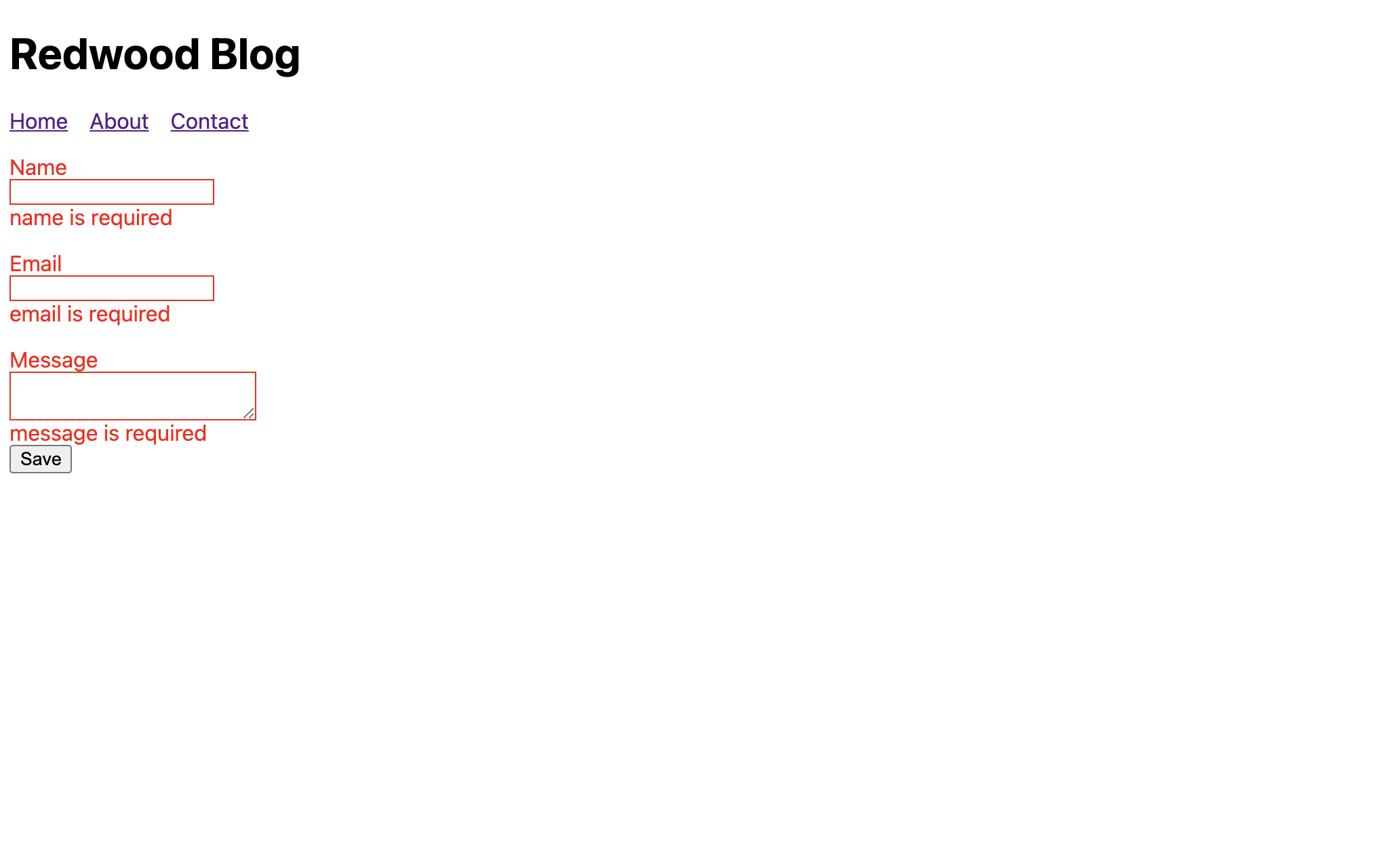
Error styling
In addition to
classNameanderrorClassNameyou can also usestyleanderrorStyle. Check out the Form docs for more details on error styling.
And notice that if you fill in something in a field that's marked as an error, the error instantly goes away! This is great feedback for our users that they're doing what we want, and they don't have to wait to click the "Save" button again just to see if what they changed is now correct.
Validating Input Format#
We should make sure the email field actually contains an email:
That is definitely not the end-all-be-all for email address validation, but pretend it's bulletproof. Let's also change the message on the email validation to be a little more friendly:
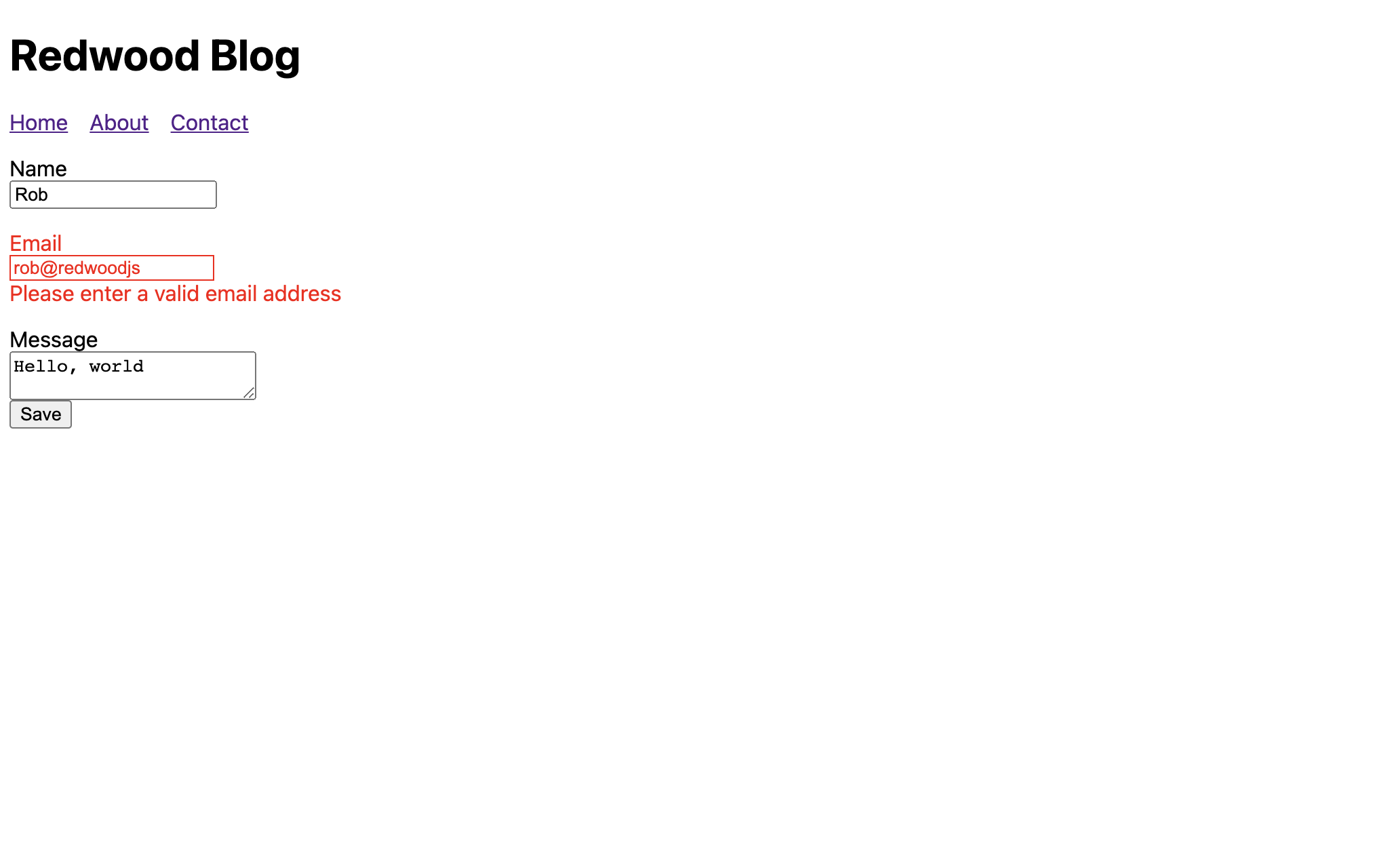
Instant client-side field validation
When a validation error appears it will disappear as soon as you fix the content of the field. You don't have to click "Submit" again to remove the error messages. This is great feedback for users (and eagle-eyed QA testers) since they receive instant feedback what they changed is now correct.
Finally, you know what would really be nice? If the fields were validated as soon as the user leaves each one so they don't fill out the whole thing and submit just to see multiple errors appear. Let's do that:
Well, what do you think? Was it worth the hype? A couple of new components and you've got forms that handle validation and wrap up submitted values in a nice data object, all for free.
Learn more about Redwood Forms
Redwood's forms are built on top of React Hook Form so there is even more functionality available than we've documented here. Visit the Form docs to learn more about all form functionalities.
Redwood has one more trick up its sleeve when it comes to forms but we'll save that for when we're actually submitting one to the server.
Having a contact form is great, but only if you actually get the contact somehow. Let's create a database table to hold the submitted data and create our first GraphQL mutation.